• Work
  • About
  • Apache Home
Menu

Randall William Montgomery

RW MONTGOMERY CREATIVE
  • Work
  • About
  • Apache Home

Welcome to my website! For the past several years, I’ve been working independently as a freelance contract creative resource for clients big and small. I’ve found success leveraging my extensive experience in brand planning, message development, positioning, creative strategy, and of course, creative evaluation and direction. I’ve accumulated a wealth of experience in many different roles in my career, so I can easily “plug-in” to any project, or team, that requires a strategic approach to creative problem-solving.

Thank you for checking out my work!

Tecfidera DTC

We did a lot of great work for this brand. The first oral treatment for MS that didn’t require a black box safety warning or monitoring due to side effect issues. This was generally regarded as one of the most successful pharma launches in history based on post-launch sales.

Tecfidera Case Study
1429 Me&MyMS Final Graded 043013B

Produced this with Passion London. They did an amazing job bringing life to the simple characters we developed. A big part of the story is that Tecfidera works with your own bodies natural defense against MS to protect against the disease. Most treatments focus only on turning down your bodies immune system which can lead to other other, sometimes very serious, problems.

Biogen_119_AFX_2_RV_2.jpg
Me_iPad_Kitchen_1.jpg
008858_biob12_OPDP_leave_behind_lo30-1_Page_01.jpg
008858_biob12_OPDP_leave_behind_lo30-1_Page_02.jpg
008858_biob12_OPDP_leave_behind_lo30-1_Page_03.jpg
008858_biob12_OPDP_leave_behind_lo30-1_Page_04.jpg
008858_biob12_OPDP_leave_behind_lo30-1_Page_05.jpg
008858_biob12_OPDP_leave_behind_lo30-1_Page_06.jpg
008858_biob12_OPDP_leave_behind_lo30-1_Page_07.jpg
008858_biob12_OPDP_leave_behind_lo30-1_Page_08.jpg
008858_biob12_OPDP_leave_behind_lo30-1_Page_09.jpg
008858_biob12_OPDP_leave_behind_lo30-1_Page_10.jpg
008858_biob12_OPDP_leave_behind_lo30-1_Page_11.jpg
008858_biob12_OPDP_leave_behind_lo30-1_Page_12.jpg
ST_16_00_Hires_v02-1.jpg
Layered files RM example 6.27.png
ST_01_00_Hires_v02.jpg
ST_11_00_Hires_v02.jpg
ST_07_00_Hires_v02.jpg
ST_18_00_Hires.jpg

TRODELVY

In the spirit of full-transparency, I had nothing to do with the creation of this award-winning campaign concept. I wish I could claim that, but it was already baked when I joined the team. As the first TROP-2 directed monoclonal antibody-drug conjugate, this was a very promising therapy in areas of high unmet need. The Trojan Horse idea was a simple, memorable way to illustrate the brand promise and the pneumonic “TRO” spanning the name, the target and primary creative property was (in my opinion) a really brilliant way to launch this new treatment. MedAd News agreed and this won a slew of awards but I can’t take credit for the idea, I was just the GCD/Art lead responsible for pulling everything through executionally. This was no small feat in itself as we had multiple simultaneous indications happening while the brand was being acquired by Gilead. It was fun while it lasted and we had a great team (clients and agency) working round the clock to make this launch a reality. These samples are literally a fraction of the work that was done, but the idea of finding a new way in to difficult-to-treat tumors was a “one-trick pony” with a lot of horsepower.

IMM180081_Promo_Journal_Ad_Sprd_LG_ISU_v1_FIN.jpg
IMM210058_Promo_Journal_Ad_Sprd_ASCENT_mTNBC_HCP_v12.jpg
TRM210002 CVA_mUC_FSU_v42_Page_1.jpg
TRM210002 CVA_mUC_FSU_v42_Page_2.jpg
TRM210002 CVA_mUC_FSU_v42_Page_3.jpg
TRM210002 CVA_mUC_FSU_v42_Page_4.jpg
TRM210002 CVA_mUC_FSU_v42_Page_5.jpg
TRM210002 CVA_mUC_FSU_v42_Page_6.jpg
TRM210002 CVA_mUC_FSU_v42_Page_7.jpg

ALIMTA

Determination manifests in different ways, for different people, at different times, but it's not a transient characteristic. It's the way a person lives. How they respond to challenges. Why they give 110% to reach a goal—even if that goal is hiking back 3 miles up a mountain for a grandchild's stuffed tiger, driving 9 hours for a special bowl of chili, or standing in line for 5 hours just to get concert tickets for their daughter.

The creative and strategic inspiration behind the "Inside All Along" campaign is to capture those moments of everyday determination that exemplify life before lung cancer. Because in these moments, we see the mentality that ultimately drives how each person faces their diagnosis and treatment. They're willing to do whatever it takes to fight as hard as they can. They're all in, and they're looking to their doctor to support their goals with a treatment that will help them fight nonsquamous mNSCLC in more than one way. These are the patients who could be right for ALIMTA + KEYTRUDA with platinum, and it's up to all of us to help oncologists recognize them.

Photography credit goes to the amazing Andy Anderson, an incredibly talented, collaborative and generous man who I’ve wanted to work with for a very long time. He didn’t disappoint on any level!

102313_006_elalns_creative_strategy_reminder_ad_spread_Page_3.jpg
102313_006_elalns_creative_strategy_reminder_ad_spread_Page_2.jpg
102313_006_elalns_creative_strategy_reminder_ad_spread_Page_1.jpg
Alimta-campaing-guide_Page_01.jpg
Alimta-campaing-guide_Page_02.jpg
Alimta-campaing-guide_Page_03.jpg
100222_041_elalns_ALIMTA_campaign_style_guide_Page_04.jpg
100222_041_elalns_ALIMTA_campaign_style_guide_Page_05.jpg
100222_041_elalns_ALIMTA_campaign_style_guide_Page_06.jpg
100222_041_elalns_ALIMTA_campaign_style_guide_Page_07.jpg
100222_041_elalns_ALIMTA_campaign_style_guide_Page_08.jpg
100222_041_elalns_ALIMTA_campaign_style_guide_Page_09.jpg
100222_041_elalns_ALIMTA_campaign_style_guide_Page_10.jpg
100222_041_elalns_ALIMTA_campaign_style_guide_Page_11.jpg
100222_041_elalns_ALIMTA_campaign_style_guide_Page_12.jpg
100222_041_elalns_ALIMTA_campaign_style_guide_Page_13.jpg
100222_041_elalns_ALIMTA_campaign_style_guide_Page_14.jpg
100222_041_elalns_ALIMTA_campaign_style_guide_Page_15.jpg
100222_041_elalns_ALIMTA_campaign_style_guide_Page_16.jpg
100222_041_elalns_ALIMTA_campaign_style_guide_Page_17.jpg
100222_041_elalns_ALIMTA_campaign_style_guide_Page_18.jpg
100222_041_elalns_ALIMTA_campaign_style_guide_Page_19.jpg
100222_041_elalns_ALIMTA_campaign_style_guide_Page_20.jpg
Alimta-campaing-guide_Page_20.jpg
100222_041_elalns_ALIMTA_campaign_style_guide_Page_22.jpg
100222_041_elalns_ALIMTA_campaign_style_guide_Page_23.jpg
100222_041_elalns_ALIMTA_campaign_style_guide_Page_24.jpg
100222_041_elalns_ALIMTA_campaign_style_guide_Page_25.jpg
100222_041_elalns_ALIMTA_campaign_style_guide_Page_26.jpg
100222_041_elalns_ALIMTA_campaign_style_guide_Page_27.jpg
100222_041_elalns_ALIMTA_campaign_style_guide_Page_28.jpg
100222_041_elalns_ALIMTA_campaign_style_guide_Page_29.jpg
100222_041_elalns_ALIMTA_campaign_style_guide_Page_31.jpg
100222_041_elalns_ALIMTA_campaign_style_guide_Page_32.jpg
100222_041_elalns_ALIMTA_campaign_style_guide_Page_33.jpg
100222_041_elalns_ALIMTA_campaign_style_guide_Page_34.jpg
100222_041_elalns_ALIMTA_campaign_style_guide_Page_35.jpg
100222_041_elalns_ALIMTA_campaign_style_guide_Page_36.jpg

Uloric

This was the first national TV campaign GSW Columbus ever did in the pharma space. I was proud to lead this effort and it was quite a learning experience. According to The Nielsen Corporation, this was the third most recalled ad campaign of 2011, which was impressive because the first and second most recalled campaigns outspent us by a 3 to 1 margin.

*I apologize for the quality of the video samples. YouTube downsamples everything with their free service and I’m currently looking for a better video hosting service. 

UloricHD3

ULORIC_dtccampaign_assets for kevin_Page_1.jpg
ULORIC_dtccampaign_assets for kevin_Page_2.jpg
ULORIC_dtccampaign_assets for kevin_Page_3.jpg
ULORIC_dtccampaign_assets for kevin_Page_4.jpg
ULORIC_dtccampaign_assets for kevin_Page_5.jpg
ULORIC_dtccampaign_assets for kevin_Page_6.jpg
Uloric case chron.jpg
Screen Shot 2020-02-17 at 7.00.14 PM.png

Lilly Oncology

One of the more rewarding aspects of working in healthcare is when you get to help establish a lexicon of terms and visuals designed to help educate audiences that are inundated with highly complex information on a daily basis. These are more than pretty pictures, there’s a story being told that communicates how a particular drug interacts with other proteins and receptors in the microenvironment of a tumor cell. I really love helping create things that illuminate a new concept or understanding of a drug, or a diseases, complex machinery. Today’s trials are discovering tomorrows miracles and helping make those scientific narratives become as clear as they can be has been a pretty cool part of my job. I think the website design we came up with that allows users to sort and filter the content from all the trials is pretty unique in this world and I’d put this site design up against anything else in pharma. A lot of great talent helped put this together but I have to give special credit to Joe Fago and Andy Ault for making it all come together so beautifully.

IL-10_color_vsn2_R2.png
Abe_color_Rnd2_V1[1].jpg
Ola_color_Rnd2_V2[1].jpg
Ram_color_Rnd2_C[1].jpg
Screen Shot 2020-02-17 at 4.22.53 PM.png
Screen Shot 2020-02-17 at 4.23.20 PM.png
Screen Shot 2020-02-17 at 4.23.29 PM.png
Screen Shot 2020-02-17 at 4.23.40 PM.png
Screen Shot 2020-02-17 at 4.23.55 PM.png
Screen Shot 2020-02-17 at 4.25.00 PM.png

CELMoD Branding Exercise

This was a very quick branding proposal developed for a new business pitch in collaboration with our sister agency Cadent. This work was developed in a well-informed vacuum over the course of 48 hours and helped win the business. Typically the development of a Brand Identity is a very collaborative process involving critical input and feedback from clients along the way. For proposals it’s sometimes helpful to show illustrations of how we think about the possibilities of an assignment in order to set expectations for future development. In this case it worked beautifully.

Celmodpresentation5_Page_04.jpg
Celmodpresentation5_Page_05.jpg
Celmodpresentation5_Page_06.jpg
Celmodpresentation5_Page_07.jpg
Celmodpresentation5_Page_08.jpg
Celmodpresentation5_Page_09.jpg
Celmodpresentation5_Page_10.jpg
Celmodpresentation5_Page_11.jpg

Emgality

For too long, migraine has been managed with treatments that were not specifically developed for migraine. As a result, migraines were a much greater economic, quality, and clinical burden than healthcare systems realized.

Patients weren't the only ones who suffered from no new treatments—healthcare systems, emergency care and primary care providers, and employers were also in peril.

We turned a spotlight on the devastating impact of migraine, equipping decision makers with the tools, information, and ideas they need to change the vision for optimum migraine care. We created a distinct visual style to highlight the data and help see the problem in a new light.

Our spotlight series collected audience-specific data with white paper positioning to call for an overhaul of migraine treatment in US health systems. The three bulletins educate through the tens of emergency rooms, employers, and primary care providers, representing a comprehensive view of the problem and the potential. Simple yet evocative infographics visually anchor the series, giving readers compelling reasons to change their outlook on migraine.

Work-Monty_Page_29.jpg
Emgality Payer
Emgality Payer
Work-Monty_Page_31.jpg
Work-Monty_Page_32.jpg
Work-Monty_Page_33.jpg
Work-Monty_Page_35.jpg
Work-Monty_Page_36.jpg
Work-Monty_Page_37.jpg
Work-Monty_Page_38 copy.jpg
Work-Monty_Page_39.jpg
Work-Monty_Page_40.jpg
Work-Monty_Page_42.jpg
Work-Monty_Page_43.jpg
Work-Monty_Page_44.jpg
Work-Monty_Page_45.jpg
Work-Monty_Page_46.jpg
Work-Monty_Page_47.jpg
Work-Monty_Page_48.jpg

GSW branding

This was a pretty cool opportunity to visually re-define ourselves when GSW merged with Palio. It coincided with energetic new leadership that wanted to acknowledge the great legacy of both brands with the new look and feel. The idea was pretty simple, but balanced, and all the key stakeholders were pretty unanimous on the direction selected. Jeremy Rosario deserves full credit for bringing this to life in such a bold, elegant way and the uniqueness of the solution in our competitive space should differentiate the GSW brand for a very long time.

gsw rebranding3Rosario_Page_01.jpg
gsw rebranding3Rosario_Page_02.jpg
gsw rebranding3Rosario_Page_03.jpg
gsw rebranding3Rosario_Page_04.jpg
gsw rebranding3Rosario_Page_05.jpg
gsw rebranding3Rosario_Page_06.jpg
gsw rebranding3Rosario_Page_07.jpg
gsw rebranding3Rosario_Page_08.jpg

Gout

I had a lot of fun doing this campaign shortly after I started at GSW. The final images were shot by the legendary Dennis Manarchy but I had fun shooting the original comps, and in many cases building props from colored paper, Sculpey, and craft foam.

rx_awards_king_ad_1.jpg
rx_awards_king_ad_2.jpg
rx_awards_king_ad_3.jpg
DSCN4657.jpg
gouttrunk7 copy.jpg
DSCN8142.JPG
45140_takulo_dtc_mc_cmpgn_bk_lo10_Page_08.jpg
BetweenFlares DRG Sponsored HD

Tre seal

I love all kinds of visual problem solving, but one of the areas I really love pertains to the modern challenges of good information design. We did a lot of qualitative market research in the healthcare space, and regardless of how I personally feel about the how dangerous it can be to draw serious conclusions from the process sometimes, there’s so much value in witnessing first-hand the tenants of adult learning in action. Doctors and health-care professionals represent an incredibly diverse population in the US. They often don’t have the same frame of visual reference for concepts like “stickiness” or “neutralization” and it’s also not surprising to hear how frustrated they can get when a message (visual or otherwise) has been unnecessarily complicated by the good intentions of a designer. It can be humbling to hear ideas critiqued this way but that’s a reality successful creatives need to embrace. It might not always lead to something that stands out in a portfolio as “sexy” per-se but when you nail the creation of visual elements that help people understand the application and inherent value of a product or service— without words—you put it in your portfolio. Right next to the pin-up girls. I designed these as a way to help healthcare professionals quickly and easily understand how Tre Seal was an entirely different adhesion technology developed for people who needed a colostomy. The site of the seal is a unique environment where the adhesive is exposed to a variety of forces that negatively impact durability. Tre Seal has 3 properties that make it valuable for its durability. I based the visual language on the lexicon of “Material Science” imagery because the training healthcare professionals receive exposes them to this visual language on a daily basis, so it seemed like a logical place to start.

045165_holosg_Tre_Seal_infographic_1_Page_4.jpg
045165_holosg_Tre_Seal_infographic_1_Page_5.jpg
045165_holosg_Tre_Seal_infographic_1_Page_6.jpg
045165_holosg_Tre_Seal_infographic_1_Page_8.jpg
045165_holosg_Tre_Seal_infographic_1_Page_7.jpg

Flamingo

By far the biggest boondoggle of my career, I got to shoot this campaign in Paris with Carlo Pieroni—the greatest living artist working in the classic “Pin-up Girl” art style, and one of the nicest guys I’d ever met. I wrote a lot of these headlines and my goal was to try and design these like tattoo art. I didn’t want them to feel dated after a few years.

minibook2006_Page_05.jpg
minibook2006_Page_06.jpg
minibook2006_Page_07.jpg
minibook2006_Page_08.jpg

Data Vis 1

I doubt many folks outside of the healthcare space will find this very exciting, but it’s one of the experiences that transformed my thinking about the role a designer or creative director needs to consider when expressing the story of data. Based on my experience, most designers don’t want to think too hard about what the data they are working with is saying. I’ve heard it numerous times and by my own admission, I felt the same way when I started woking in the healthcare space. I simply didn’t understand the visual language of data, or how much more meaningful it was in the healthcare space than words. Nothing is more thoroughly tortured by regulatory officials than the words used to create claims about a drug. There’s a very good reason for this as there is almost ZERO certainty that the intended effect of any drug will “definitively” happen for any individual patient. This is why the messaging in the pharma space feels anything but reassuring when you balance the uncertain good results you might get against the safety risks associated with the drug. It’s not all bad however, the most compelling message recalled from the Viagra launch came directly from the risk information. Men saw “…4 hour erections…” as a reinforcement of the effect they wanted, not the emergency-room nightmare such a thing would really be. But I digress. The point I’m making here is that the data can provide an opportunity for visual storytelling even when the words you’d like to use are prohibited. There was nothing untrue about the message that tested so well, it wasn’t usable though because the data wasn’t a pre-specified endpoint for this particular trial because the treatment guidelines changed after the trial started. While that was very unfortunate, we did create an elegant solution for expressing the “story” of that message with the visual approach I designed.

data vis message example-Blinded_Page_1.jpg
data vis message example-Blinded_Page_2.jpg
data vis message example-Blinded_Page_3.jpg
Data visualization4.2_pages_Page_2.jpg
Data+visualization4.2_pages_Page_1.jpg

Data Vis 2

This is a simple illustration of the kind of work I’ve done quite a lot of over the years. This particular sample is part of an exploration we did for some phase 1 data that wasn’t translating the correlation of dose size to the reduction of brain plaques effectively.

By using the brain-scans as part of a color key linked to the specific dose strengths, the eye is naturally led to the connection between the mg strength and the resulting reductions of brain plaques. It was right there, it just needed to be re-thought as a linear graph vs bar chart.

While it may not seem that revolutionary, when placed in the context of an over-all narrative that might contain 80 slides, the point has to come through quickly and credibly.

When it comes to good data vis design, I really think you have to make it clear before you make it cool. There are a lot of unintended consequences some very good designers unknowingly create when they don’t understand what the data needs to communicate.

BEFORE
BEFORE

AFTER
AFTER

Pitch

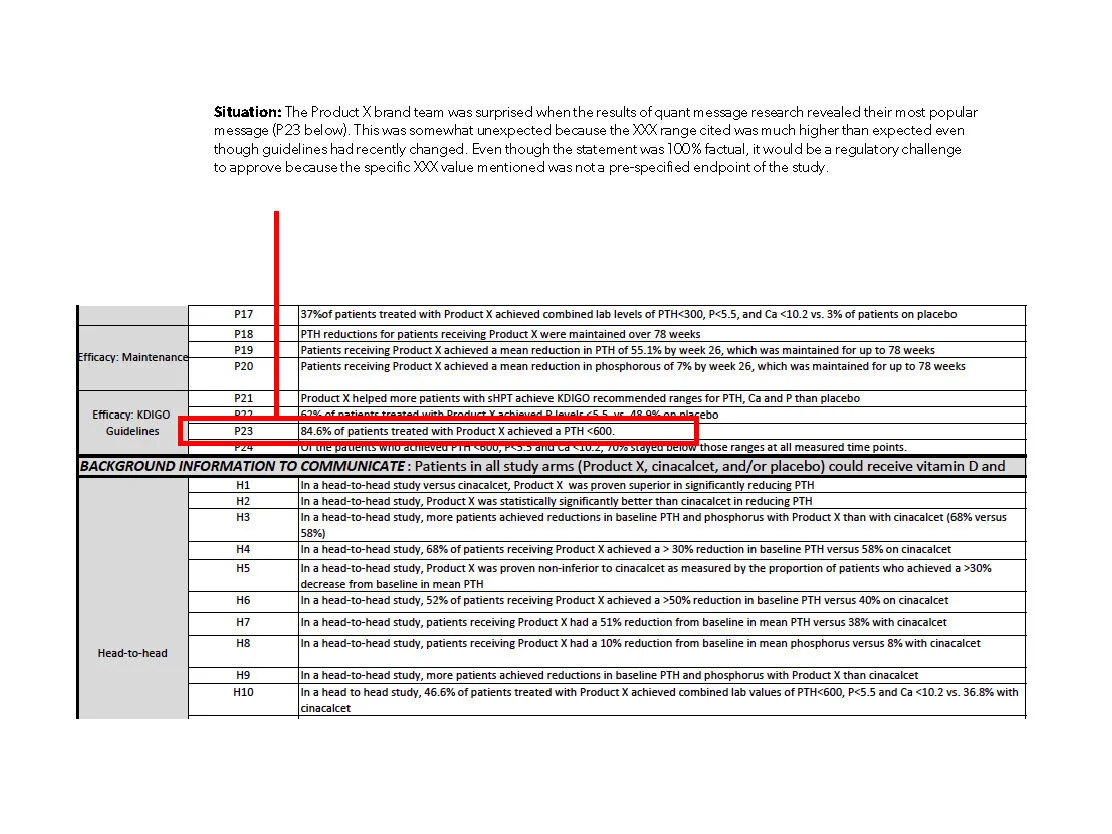
I wrote this script for this video a pitch we had for this amazing new antibody-drug conjugate that was scheduled to launch this year.

Andrew Ricard did a beautiful job editing. I think it’s a pretty universal picture of the dynamic therapeutic landscape in oncology for the next few years. I really wish we would have won this pitch. This drug was about as cool as it gets.

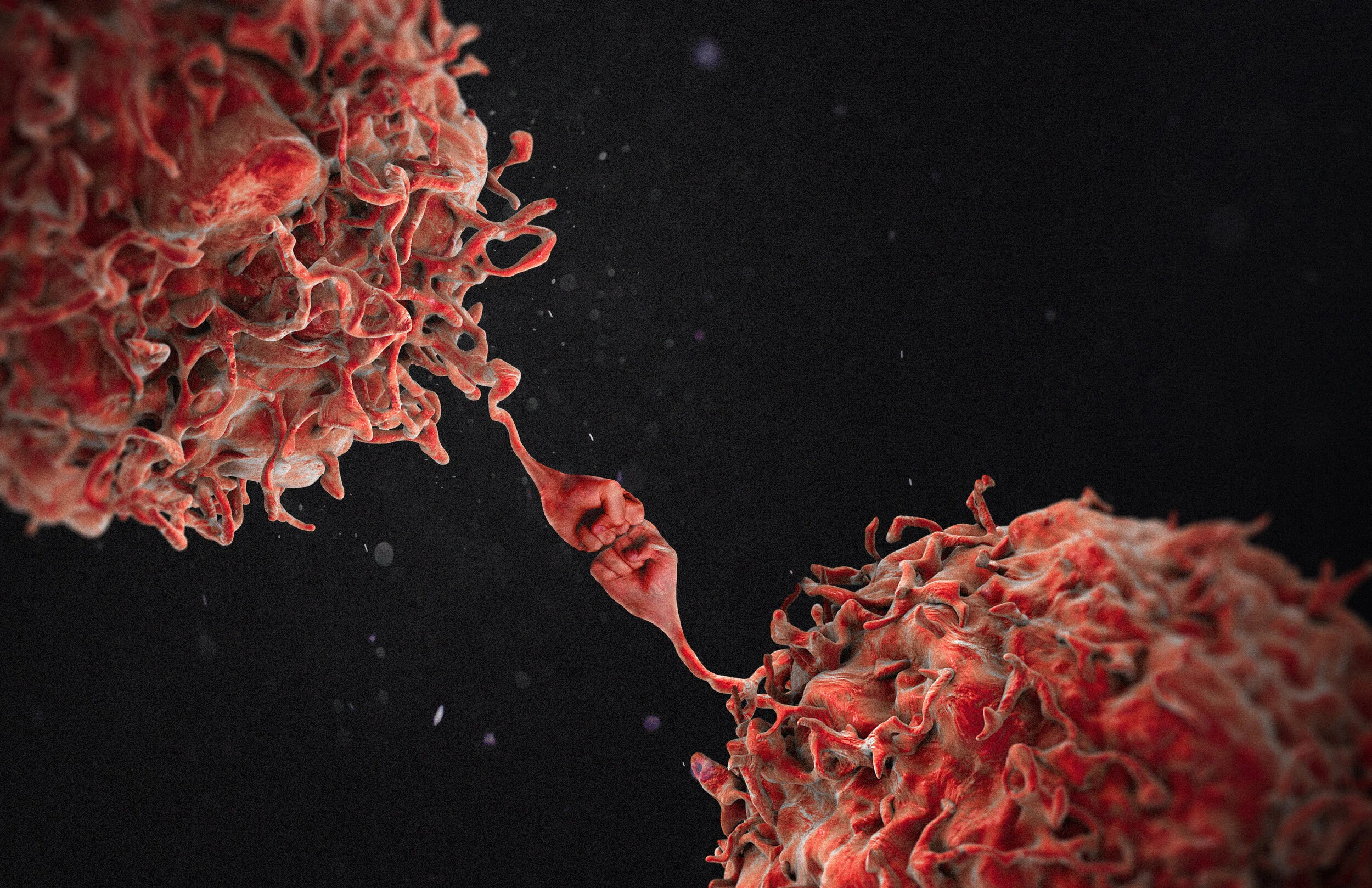
The treatment is a combination of 3 distinct components that are physically bonded together and infused into the bloodstream. One component is an antibody that has a very strong affinity for a receptor (Nectin-4) that is highly expressed on the surface of cancer cells. So it acts almost like an airplane that delivers the other 2 components directly to cancer cells—leaving healthy cells that don’t express Nectin-4 alone.

Once attached to that receptor, the antibody along with its cytotoxic payload (a very powerful chemotherapy drug) are pulled into the cancer cell as a form of endocytosis. Once inside, the linker holding everything together is cleaved which activates the chemotherapy and causes the cancer cell to self-destruct.

Like I said, this is about as cool as it gets. Not only does this selective targeting reach previously unreachable, inoperable and highly resistant cancers with a highly effective way to kill cancer, the specificity of this newly identified target reduces the side effects caused by traditional treatments that are equally lethal to healthy cells.

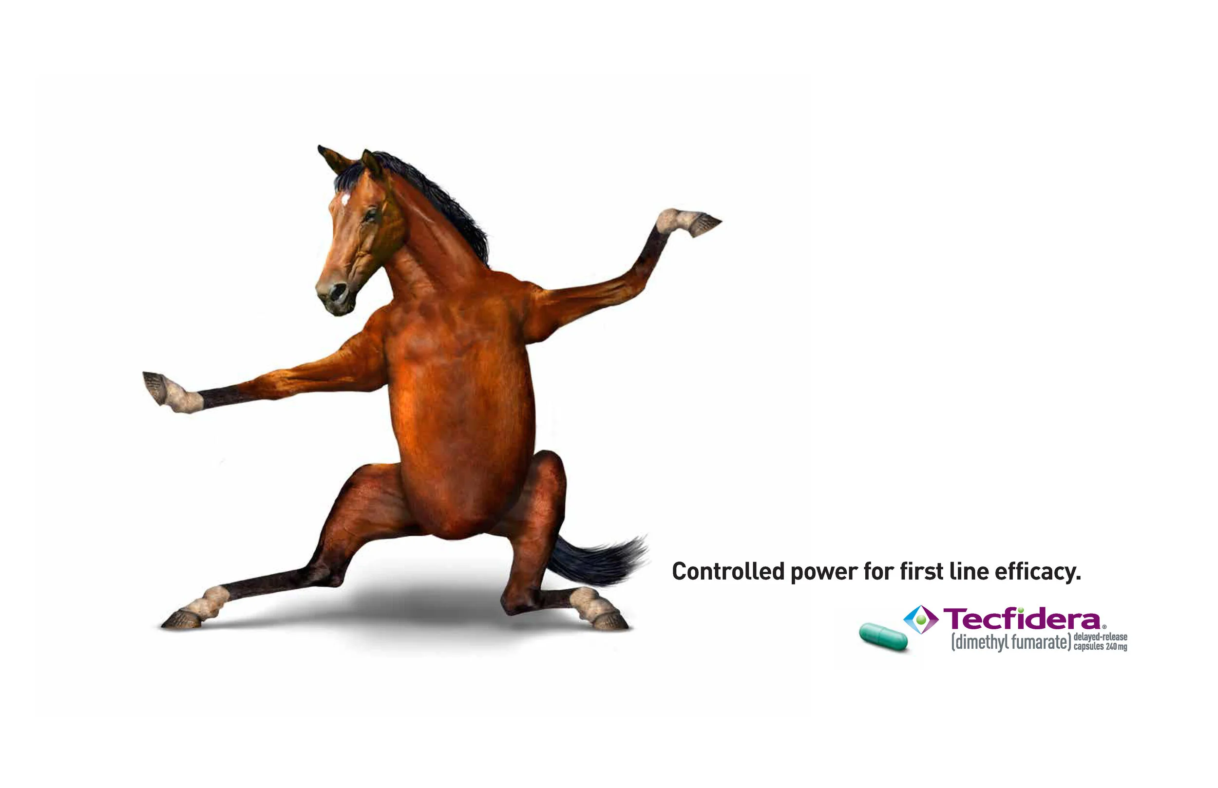
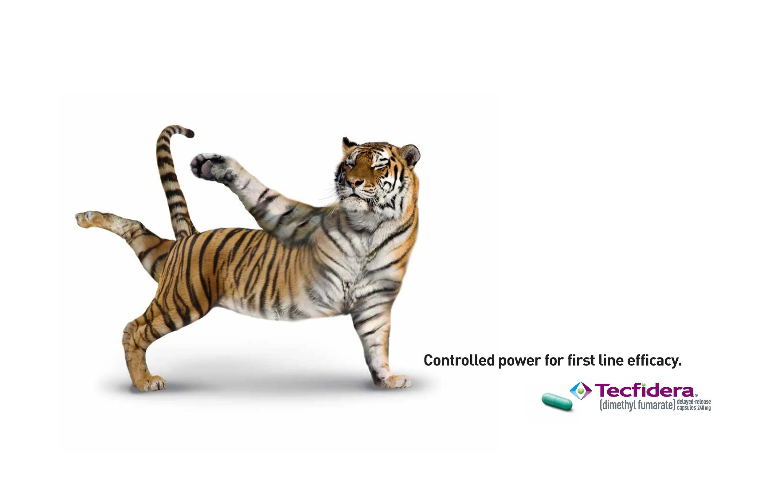
The disease awareness campaign here was built around introducing the target receptor in a provocative, memorable way. We called this creative platform “The Achilles Protein” and developed metaphorical ideas for depicting why it’s so important relative to highly resistant cancer types.

This is all “pitch” work so the ideas were never produced and my description of the conceptual nature should not be interpreted as product promotion in any way.

*I apologize for the quality of the video samples. YouTube downsamples everything with their free service and I’m currently looking for a better video hosting service. 

Astellas/SeaGen
Pages for MK-prese_Page_05.jpg
Pages for MK-prese_Page_06.jpg
Pages for MK-prese_Page_08.jpg
Pages for MK-prese_Page_09.jpg
Pages for MK-prese_Page_10.jpg
Pages for MK-prese_Page_11.jpg
 This is a summary of the other “creative platforms” I presented at the pitch. We had a lot of fun presenting the ideas and the room seemed very engaged with our thinking. Losing never feels good but we made some friends there that day we still keep

This is a summary of the other “creative platforms” I presented at the pitch. We had a lot of fun presenting the ideas and the room seemed very engaged with our thinking. Losing never feels good but we made some friends there that day we still keep in touch with.

Pitch 2

These are a few of my favorite concepts from the pitch for Tagrisso. We had multiple strategies to work from as part of the assignment. Not idea but not uncommon when creative is used to validate positioning. That’s a whole different subject but the work we did was called out as the best creative the AZ team saw in the pitch process. We didn’t win but that was nice to hear, at least.

trees.jpg
buildings_2b.jpg
mountains_2.jpg
OncologyCentricSamples-Monty_Page_24.jpg
OncologyCentricSamples-Monty_Page_26.jpg
OncologyCentricSamples-Monty_Page_27.jpg

Tecfidera HCP

This campaign was directed at doctors who treat MS. They had a totally different set of concerns and interests about the drug than patients did so the brief led us to concepts that were focused on the idea of power that was never out of control. These metaphorical animals representing the drugs efficacy tested globally better than any idea I’ve ever developed. It never ran, but the concept was so inherently simple, it effectively transcended the language barriers that are so difficult to overcome with global launches. It was also extremely different for the MS space but in a way that was somewhat charming and memorable. Drew Robinson from SPORK did an amazing job with the comp creation on these.

Tecfidera_hcp_ad_lobs_round6_Page_05.jpg
Tecfidera_hcp_ad_lobs_round6_Page_06.jpg
Tecfidera_hcp_ad_lobs_round6_Page_14.jpg
Tecfidera_hcp_ad_lobs_round6_Page_08.jpg
Tecfidera_hcp_ad_lobs_round6_Page_11.jpg
med-gorilla2.jpg

Best Wishes

This was a bit of old-school fun, creating a real 3-dimensional Christmas Tree Plot that represented the virtual well wishes from all of GSW’s employees to their clients. Yes, that kind of plot is a real thing and is typically used to illustrate the scatterplot of data inside a bell-curve. I thought it was a charming and fresh way to express our best wishes for the holiday’s in a slightly geeky, yet self-deprecating way.

Holidaywishes4.jpg

GSW Conference Room Branding

This is one of those fun projects that coincided with a huge remodeling effort of the GSW space in Columbus. We had new creative leadership that brought an amazing sense of energy to the project and even though the construction was disruptive at times, the work being done was transforming the space in so many positive ways our ECD (Marc Lineveldt) realized we needed an entirely new system for naming all of the new room spaces that were being created.

So there was a contest and I won. :-)

My idea was really based on the chemistry of agency culture. Great things happen in those rooms when people from different backgrounds and skill-sets get together to solve problems, so why not create a naming system based on the essential building blocks of matter?

The building has 3 floors that were divided into quadrants based on specific agency disciplines, (Account, Creative, Strategy, Production…) so there was a bit of purposeful fun that went into selecting the specific elements involved.

Marc really loved the idea and Cary Whit did an amazing job bringing this to life. For a creative agency that strives to make science more personal, I’m proud to have left a contribution like this there.

IMG_0239.jpeg
IMG_0238.jpeg
GSW_Room_Signage_Updated_7_24_Page_03.jpg
GSW_Room_Signage_Updated_7_24_Page_04.jpg
GSW_Room_Signage_Updated_7_24_Page_11.jpg
GSW_Room_Signage_Updated_7_24_Page_12.jpg
GSW_Room_Signage_Updated_7_24_Page_14.jpg
GSW_FLOOR_PLAN1_CW.jpg

American Airlines

This was the first campaign American Airlines ran after the horrible events of 9/11. This was the most difficult thing I've ever worked on but also the most rewarding. A lot of the footage in the final spots came from old home movies we sourced from TM employees, including some old super 8 film from my family. Peggy Sirota directed the spots beautifully. Adam Arkin did the VO. Jack Waltrip from CUT did an amazing job editing.

AA-Family

The first spot in the series. Still very proud of this effort.

AA Friends

You can feel a slight shift in tone as the distance from the event grew longer. Elias did the same basic score differently for all 3 sports and that had a tangible effect on how these resonated emotionally.

AA Getaway

The third and last spot in this campaign. This started running around 10 months after the first ad broke.

 This was a print campaign I did for American prior to 9/11. It picked back up after about a year.

This was a print campaign I did for American prior to 9/11. It picked back up after about a year.

USA.jpg
VanClybern.jpg
Manhattan.jpg

Toastmasters

Jackie Hathiramani and I put together this nice campaign for Toastmasters International. They had an office in our building in Irving at the time and needed help attracting the attention of the professional residents of the space. This was fun, they had no budget so I actually made all of the props and shot these with the amazing Philip Esparza.

Toastmasters_Page_1b.jpg
Toastmasters_Page_2b.jpg
Toastmasters_Page_3b.jpg

Nortel

Probably my second biggest boondoggle, this campaign was an art directors dream. The brilliant Leigh Sanders and Brad White came up with the framework for this idea and the simple concept was to position Nortel as an internet company. The formula for this campaign required an executional approach that was as unique as the people we were featuring in each ad. I got to photograph the beautiful Mrs King with my friend Jimmy Williams, John Woo with the amazing Howard Schatz, Tim Duncan with Michael O’Brien…the list goes on. I was grateful to have contributed to this wonderful campaign.

Woo.jpg
minibook2006_Page_14.jpg
minibook2006_Page_17.jpg
minibook2006_Page_15.jpg
minibook2006_Page_16.jpg

Spicer

This is the concept that probably got me the job at TM advertising in Dallas. Shot with the late great Steve Grubman, this was part of a broader campaign that featured trucks with multiple personality disorders due to drivetrain parts procured from different sources. This was a ton of fun as it was the first time of many times I worked with Steve. I don’t have the elephant shoot we did together in here but that might be something I put on my blog. Crazy to see three full grown elephants walking down West Morgan in Chicago in the middle of January. We didn’t photograph them outside, they were simply walking from their trailer to the studio. Peoples reactions were priceless!

frankenadnew.jpg

V-22

This was a nice campaign I did with my good friend Tom Demitriou—the most brilliant writing partner I’ve ever worked with. These ran as full-page ads in newspapers around the beltway when funding for the joint program was critical. It was a controversial vehicle until people understood that it could take off and land anywhere (like a helicopter) but it could fly three times faster than the fastest helicopter (like an airplane). I think people understood the way it worked but not why that was important. Once they did, the rescue implications alone made it one of the transformational pillars of the modern military.

Hell and BACK copy.jpg
marines copy.jpg
Special ops1 copy.jpg

Bally's

Still one of my favorite campaigns shot with one of my favorite photographers. Jimmy Williams is always a pure joy to work with and it was fun finding the talent and locations on the fly. The branding from this campaign extended into all of the property signage and materials as well.

minibook2006_Page_11.jpg
minibook2006_Page_12.jpg
minibook2006_Page_13.jpg

Editorial

These illustrations were developed as concepts for an editorial on “de-coding” cancers secret language.

Speaking_Secret_Language.jpg
Speaking_Secret_Language_V3.jpg
TAGRISSO_mute_the_mutation_1.jpg
TAGRISSO_mute_the_mutation_2.jpg

A different kind of insulin

We were asked to translate a scientific narrative developed by another medical education company into a simpler visual format that could help viewers understand more easily how this new kind of insulin worked differently than existing insulin and why that’s a good thing. This was a fun, fast, project that forced a level of executional simplicity that really helped communicate the story elements more effectively.

Hepato-preferential insulin

St. Elizabeth

This was work I contributed to an “all-hands-on-deck” agency pitch for the St. Elizabeth business. We won the pitch and this idea was called out as a highlight. As this business was assigned to a different group, my involvement with the account ended. The team developed new concepts that went into market research but this idea was eventually chosen and it launched during the Super Bowl. It also won an Emmy. I was never thanked for the initial effort put into this concept, which was truly a heart-breaking reminder of how lousy this business can be at times. The final spot that made it on air in available on YouTube. I think it would have been more authentic if some actual video footage of “right-place/right-time” good Samaritans had been used but obviously the core of the initial concept remained intact.

St E right there_Page_1.jpg
St E right there_Page_2.jpg
St E right there_Page_3.jpg

Freebies

Small projects done for fun. And good karma. Hopefully.

Brynn-Barnett-Sheriff-logo-Facebook-mobile-cover-photo4.jpg
jhunterco2 copy.jpg
Robert G. Montgomery Supreme Court 4 copy.jpg
Combined flags.jpg
KSES1.jpg
ARDENT-LOGO-BW-SOURCE-1 copy.jpg
phenotype-01.jpg
BVA1-04.jpg
Brynn-Barnett-Sheriff-Logo-Facebook-Cover-Photo.jpg
Brynn-Barnett-Sheriff-logo-Facebook-mobile-cover-photo.jpg
BB-Sheriff logos_Page_1.jpg
BB-Sheriff logos_Page_3.jpg

Sock-Puppet Theatre

One of the joys of being a Creative Director is when you have people that truly surprise you by taking a small opportunity and turning it into something amazing. Andy Spitzer, Tom Leach, Dennis Leahy and Nic Salter created these videos in their entirety, before we had a full-fledged film production studio or more sophisticated editing tools. They did these because they were having fun and we sold the approach to a client who genuinely loved the “handmade” direction. Internal reminders for sales rep training have never been looked forward to until these folks set a new bar for doing these in a fun, engaging way. All I did was not get in the way.

MDS fewGoodReps 05post

MDS silence 08post
quiz11 post
prev / next
Back to rwmontgomery.com
Tecfidera Case Study
22
Tecfidera DTC
9
TRODELVY
102313_006_elalns_creative_strategy_reminder_ad_spread_Page_3.jpg
39
ALIMTA
ULORIC_dtccampaign_assets+for+kevin_Page_1.jpg
9
Uloric
10
Lilly Oncology
Celmodpresentation5_Page_04.jpg
9
CELMoD Branding
MMM_migraine.jpeg
18
Emgality
8
GSW branding
8
Gout
5
Tre seal
4
Flamingo
5
Data Vis 1
BEFORE
2
Data Vis 2
Astellas/SeaGen
8
Pitch
6
Pitch 2
med-gorilla2.jpg
6
Tecfidera HCP
1
Best Wishes
8
GSW Conference Room Branding
AA-Family
7
American Airlines
Toastmasters_Page_1b.jpg
3
Toastmasters
5
Nortel
1
Spicer
3
V-22
minibook2006_Page_12.jpg
3
Bally's
4
Editorial
Screen Shot 2020-03-02 at 12.41.22 PM.png
1
A different kind of insulin
3
St. Elizabeth
Brynn-Barnett-Sheriff-logo-Facebook-mobile-cover-photo.jpg
12
Freebies
MDS fewGoodReps 05post
3
Sock-Puppet Theatre

Powered by Squarespace